Better bad weather with oldWeather

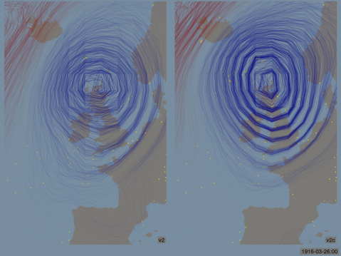
A spaghetti-contour plot of a storm in 1916 as reconstructed by the 20th Century reanalysis. On the left, without oldWeather observations, on the right with the oldWeather ships added. The yellow dots mark observations used in the reconstruction – the additional yellow dots in the right image are from Royal Navy ship logs transcribed by oldWeather.
Next week sees an important event in the calendar of the observational climatology community: the ninth annual meeting of the Atmospheric Circulation Reconstructions over the Earth (ACRE) project, in Maynooth, Ireland. I’ll be there to talk about the new knowledge we are generating with oldWeather, and I thought I’d share a sneak preview here.
The picture above is a pair of contour plots: on a map contour lines mark places with the same height and they are used to show the shape and size of hills. Here the lines mark places with the same atmospheric pressure, and they show the size and shape of a valley in the atmosphere – an atmospheric depression – a storm. The picture is messy because this is also a spaghetti plot – I have 56 different maps of the same storm (the individual ensemble members of the 20th century reanalysis) and I’ve drawn all 56 in the same image.
In an ideal world we’d know exactly the size and shape of this storm, so all 56 maps would be exactly the same and the plot would show pin-sharp simple contours. We’re not there yet, but adding the oldWeather observations to the reconstruction has made things a lot better – our map of this storm is much more precise than it was before.

Trackbacks / Pingbacks